King County, Washington, is unique when it comes to elections in many ways, most of them surrounding the recent hand recount for Governor there. There is one way in which it stands out which you may not be aware of, though. King County is one of the only large counties, perhaps singular, where a complete canvass of the election including a precinct-by-precinct breakdown of the absentee vote is provided.
You may find this article unique in that I'm not trying to actually offer any hypothesis as to voter behavior, error, or fraud. I am just presenting the raw data in a few graphical formats, and readers are welcome to draw any conclusions they see fit. (Apologies are offered to the color-blind and those with low monitor resolutions.)
Washington implemented early voting the easy way, by simply removing the restrictions on absentee voting such that anyone can do so, no note from doctor or mom needed. About two thirds of the votes cast in King County this year were absentee ballots. As such, in the aggregate, it is no longer a risk to voter privacy to publish absentee voting numbers; When there are few absentee votes, publishing these numbers could allow a small community to figure out who an absentee voter cast their ballot for. King County's very detailed canvass affords the rank amateur electionographer (people like me, and no it probably isn't a real word) the opportunity to find out some really fantastic things about early voting. Unfortunately King County did go a bit too far on the privacy front in publishing this information for extremely small precincts.
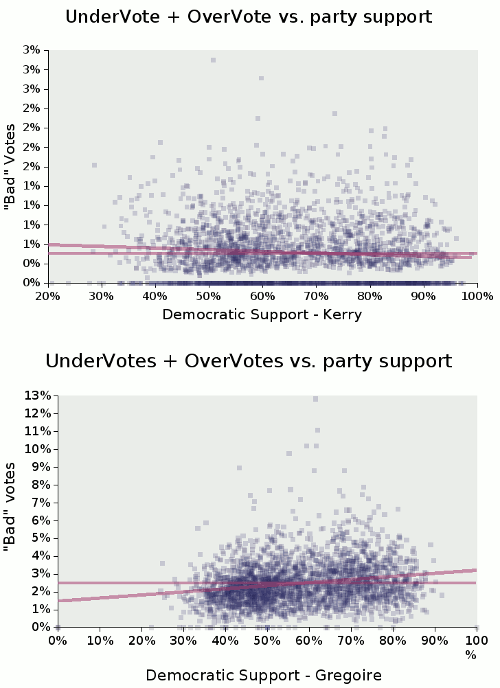
One of the first things we always look at is the undervote/overvote, and what the correlation between that and party support is. This information is available for many county BOEs, but astonishingly, is not made available by many. The following charts show the party-based pattern of undervoting and overvoting in King County. For brevity, I have lumped them together, though King County did provide separate numbers. (As a rule of thumb, undervotes usually dwarf overvotes, and do so in this case.)
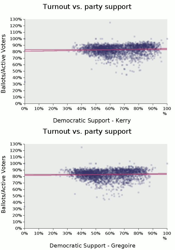
Another popular chart is turnout versus party support, which can sometime tell us which party benefitted the most through GOTV drives. The figures provided for "registered voters" in the King County canvass do not represent all eligible voters, only those with "active" status, meaning they voted recently in past elections or recently tendered or altered their registration. So the figures above one-hundred percent are nothing to get excited about.
All this is standard fair. What is special is that we can look at the same graphs for absentee versus booth voting. Again, for brevity, I have not included figures for a third type of ballot: provisionals. (Note: I threw one outlier point from the "booth" graph for an extremely tiny precinct, so that the rest of the points are not compressed.)
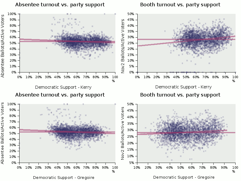
The grouping of all these graphs is interesting. There is a large group representing more centrist precincts, and another, clearly distinguishable group representing heavily Democratic precincts. King county being a blue county, there are not very many heavily Republican precincts. What's also interesting is the pattern of high undervotes and high/low turnout, which seem to occur most in the lightly populated middle, but not at the extremes.
Let's take a look at the percentage of absentee ballots cast statewide, and also in each of the five districts where elections for the State Senate were held. The charts on the top, in blue, are Democratic candidates, and those on the bottom, in red, are Republican, though in the case of the Supreme Court races, the party is not printed on the ballot, and in fact sometimes Supreme court races can buck partisan trends entirely, as we see with the Sebring/Sanders race.
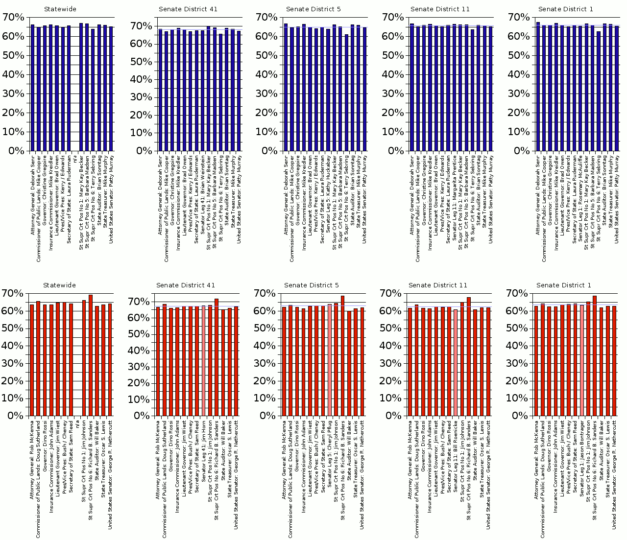
That which smacks one in the face when looking at these charts is how the absentee ratio itself may change, based on whether a district is more red or more blue, the relationships between the candidates remain mostly the same. Note the lighter colored bar is the local Senate candidate, and it fluctuates because it is actually a different person. The rest of the bars keep the same basic shape, though the scale and mean of the party's absentee ratio changes.
There are a few more points of interest less obvious. The first is that Democrats, not Republicans, had higher early/absentee ratios in King County, despite the fact that, from previous graphs, we see higher turnout in absentee votes helping Republicans, if anything. I'm still trying to wrap my head around that one.
The second is a misconception that some may harbor about mail-in early voting is that "ballot roll-off" -- where candidates far down towards the bottom of the ballot get fewer votes -- is less likely in the mail-in voting. I certainly thought so. One would suppose that, given the fact you can curl up with your ballot, a hot mug of cocoa, and a voter guide, roll-off would be diminished a lot by early voting. However if we look at the data, the effect is not very strong. This could be a sign of the times... with a sharply divided electorate, or an intellectually lazy one, or a combination of both, "straight party line" ballots may be more common. Only the Supreme Court candidates, whose party is not listed on the ballot, strongly show the commonsense increase one would expect of down-ticket races. (Do note, in the Sebring/Sanders race, voters crossed "party" lines, and several voter guides reflect this fact. Calling Sebring a Democrat for the purpose of this graph is a bit of a stretch.)
The division of the "vertical market" into Senate districts is, of course, only one way of grouping the data. Grouping is neccessary because, much like what I'm told of quantum physics, data on the precinct level contains too much noise to be useful. It is only in the aggregate that the data produces discernable patterns. Using the boundary lines of minor races makes sense in that it automatically compensates for one factor that may influence a voter's decision as to when to vote -- campaign spending and tactics. However, grouping by demographics may provide other useful insights.
The below charts give us a bird's eye view of the absentee vote by breaking up the data into overlapping precinct subgroups based on the intersections of different local races. They are sorted by aggregate average value in both directions, to provide a clear look at the data, and I have moved the local candidates to the back for the same reason, which unfortunately obscures them in some cases. Without making any inferences, the Democratic graph appears smoother and more uniform than the Republican graph. Note that the seemingly abberant row representing the intersection of Federal House District 2 and State District 39 consists of only two precincts, so some wierdness is to be expected. You can also see the cross-party voting evident in the Sebring/Sanders race as it follows a different pattern on both graphs.
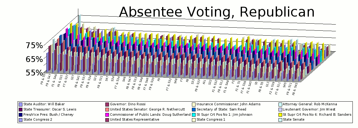
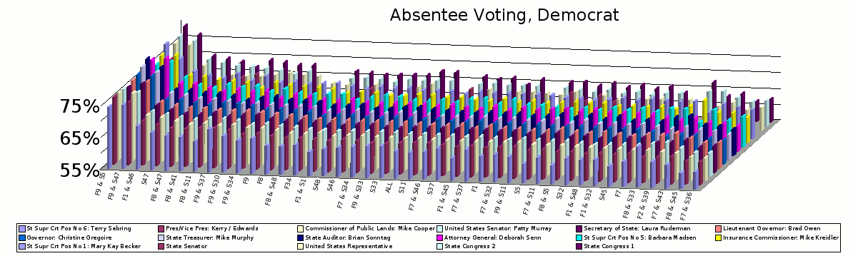
There are questions raised simply from looking at the axis. For example, why is the polling place "rolloff" in the Governor's race so extreme for Republicans, with Wiest (and several down-ticket offices) getting much more of their vote totals from absentee than Rossi? On the other axis, why are the absentee ratios in Federal District 7 and State District 37 so much higher for Republicans than Democrats, with the districts appearing to the right on the first chart, and to the left on the second (and with an evident deviation in the overall pattern between the candidates in the two leftmost of those groups on the Republican chart)? I won't struggle to conjecture.
I will make one point, however. Data of this granularity has implications far beyond determining mail-in voter behavior. Many types of errors or attempts at fraud in either the absentee voting system, or at the polls, can potentially be detected by analysing this data. In the case of fraud, the presence of two separate voting systems complicates the job of a vote-rigger -- any "adjustment" made to one system in a small set of precincts would have to be compensated for in the other system to avoid creating anomolies. We should be as wary of calls for a more "unified" voting system as we are of calls to do away with exit polling. Such would rob us of a valuable tool for verifying the integrity of an election. While it is important that voting afford all citizens an equal expedience, regardless of race, class, or party affiliation, separate methods of voting are, on balance, a boon.
Where the boundary between the size of precinct groups and the usability of the results lies is something I am happy to let a paid professional fathom, but I think we can see that, although there are limits to how human-readable complex data can be made, and how much analysis can be done by eye, allowing the public access to election data may provide us with innovative ways of conceptualizing electoral politics. Boards of Elections should be encouraged to provide the public with a detailed canvass with absentee voting broken down to a level just shy of violating the privacy of voters. It will aid in the electorate's ability to verify with confidence that an election was fair.
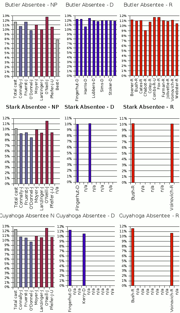
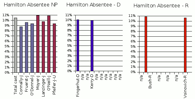
In closing, let's take a look at the few Ohio counties for which I was able to obtain absentee ballot breakdowns. Much ado has been made about strange goings on at the bottom of the ticket in Ohio's punchcard counties, as well as all races being impacted by Ohio's "Caterpillar Ballot" in punchcard counties. If more of the BOEs in Ohio had provided some level of absentee vote information up front, perhaps a better picture of what went on there would not be so hard to obtain. Unfortunately I myself have only found/processed the following data:
If you would like to see our elections independently audited by people with much more training than me, please visit